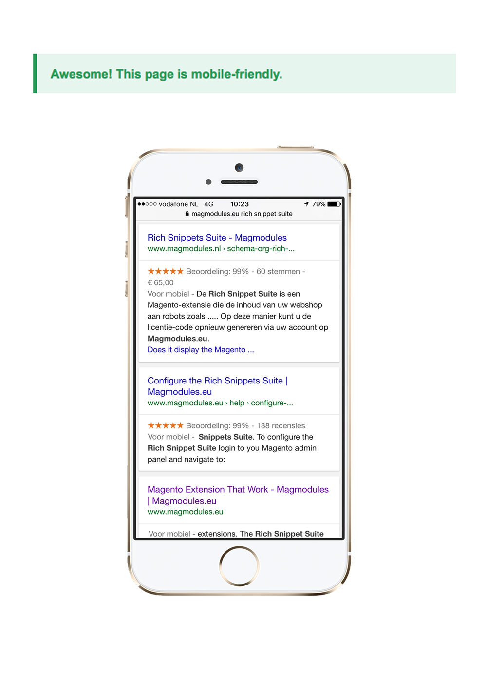
Check the Magento 2 Google friendliness for mobile


Perhaps you’ve done a complete magento® store upgrade or have at least taken steps to make your magento® store more mobile-friendly; maybe you’re still on the fence. This period of indecision may be coming to an end with the testing of Google’s latest mobile-friendly search icon.
Mobile friendly icon on your Magent®o store
On September 30., Google began testing new mobile-friendly icons. When a user performed a search on a mobile device, a small green mobile-friendly icon would appear on magento® stores that were mobile-friendly. This allowed users to proceed knowing they would be able to view the content they were interested in.
Then, on October 13, the search giant changed their methodology by displaying non-mobile-friendly icons – gray cell phones with lines through them indicating non-usage. Same idea, different methods – this time, the network was punishing those magento® stores that were not friendly rather than rewarding those that were.
October 14, there was yet another change in methodology. This time, magento® stores that appeared in search results on mobile devices that were deemed mobile-friendly were accompanied by the words “Mobile-friendly” in gray.
The jury is still out on what Google is looking for and what the search company will decide to do with the information that is gathered from mobile users and how the icons being tested affect search results, but, one thing is certain: soon, whether a magento® store is mobile friendly or not will be very easy to determine. magento® stores that are not mobile friendly may end up being displayed lower in search results, though this is just speculation at this point.
What does this mean for your web magento® store? Are you prepared to stay on top if a major change takes place as a result of the testing that is underway?
Why Mobile-Friendliness Matters Anyway
As a brand, you might be fairly pleased with your magento® store right now. You’re bringing in the revenue you’d expect, your conversion rate is high and your traffic levels seem to stay steady or increase on a regular basis – why change the system?
As evidenced by Google’s latest system experiments, what’s worked in the past might not be enough to stay competitive going forward.
Not convinced? Consider the following statistics related to mobile device usage.
- Mobile devices have been a driving factor in an increase in time spent online. In fact, since 2010, the time the average individual spends online has doubled.
- 91% of adults in the United States own a phone; 61% of those phones are smart phones.
- In 2012, marketers spent $4.4 billion on mobile advertising in the United States alone. By 2013, that number doubled to $8.5 million. By 2017, the figure is expected to fall around $31.1 billion. Search and PPC advertising accounts for nearly half of this budget.
- 25% of adults in the United States only use a mobile device to access the Internet. PCs have become tools of the past.
- Organic search results matter now more than ever before. In fact, one-third of all search clicks go to the top organic result; this means that the mobile icons Google is testing could play a larger role than you’d imagine going forward.
Put simply, mobile device usage has been steadily increasing since the beginning of the decade. With enhanced smart devices, online usage among owners of these devices has also changed. To reach your target demographic while standing out in se arch results, you must optimize your magento® store today.
Steps for Magento® Mobile Optimization
Ready to jump in, or at least to start the mobile optimization process? Below are a few tactics and tips for getting started.
1. Keep it Simple
Look through your webmagento store. Determine what is “essential” information and what would could be considered “fluff.” If it’s essential, keep it. If it’s not, get rid of it. It’s that simple.
Today’s mobile users are looking for information that gets them where they want to go. They’re looking for short blocks of text that provide relevant, useful information. They want to know how to contact you and how to connect on social media. They want products to be easy to find. To allow for this ease of use, your magento® store should be about the basics. Long gone are the days of 10 page navigation bars and detailed, 3,000 word blog posts. Keep it simple.
2. Consider a Mobile-Layout
You might be attached to your current layout. This doesn’t mean that it’s right for mobile users. In fact, traditional and newer layouts that look fantastic on PCs and larger screens could be cumbersome for mobile devices.
If you don’t want to change your entire magento® store, at least consider creating a mobile version or app that can be easily accessed by mobile users. These magento® stores contain simplified layouts with modified options – leave out the heavy photo pages and drive focus to where you want it: contact pages, order pages, search pages and account logins. Leave your blog posts and intricate designs for your standard page.
3. Maintain Your Brand
Remember, just because you have two versions of your magento® store doesn’t mean you have two brands. Make an effort to ensure your mobile magento® store matches your standard magento® store.
Carry over elements like:
- Color schemes,
- Word-choice,
- Logos and any other elements that make up your brand.
Source: http://searchengineland.com/
